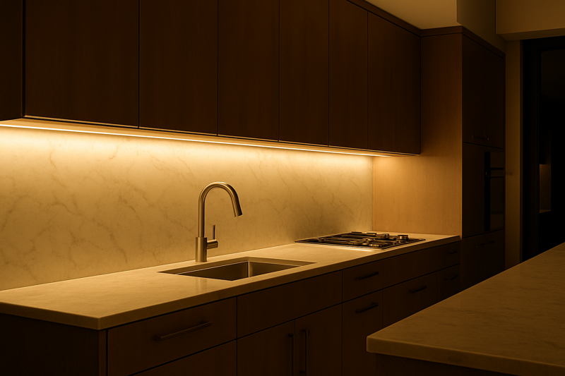
You’ve just finished a stunning kitchen renovation. But when you turn on the under-cabinet lights, the expensive granite countertop looks dull and strangely colored. The client is unhappy, saying the "white" light you installed feels wrong and makes their new space look cheap.
To achieve professional results, you must master two metrics: Color Temperature (CCT) for the shade of white (warm vs. cool) and Color Rendering Index (CRI) for how accurately that light reveals the true colors of objects. For high-end projects, always specify a CRI of 90 or higher.
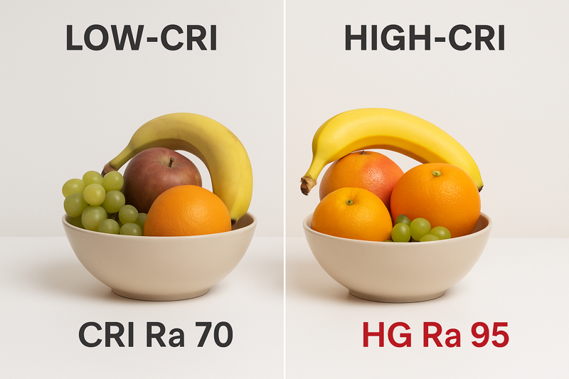
I once consulted on a project for a high-end retail boutique. They had spent a fortune on their inventory of luxury leather handbags. Their contractor installed standard LED strips in all the display cases. A week after opening, the store manager called in a panic. Under the lights, the deep red bags looked brownish, and the rich navy bags looked almost black. The products looked lifeless, and sales were suffering. We replaced all the cheap strips with our high-CRI 95+ products. The change was instant and dramatic. The colors of the leather became rich and saturated, exactly as the designer intended. The manager told me, "You didn’t just change the lights; you saved our entire product launch." This is the power of color accuracy. It’s not a luxury; it’s a necessity for any space where color matters.
What is Color Temperature (CCT) and Why Does It Matter?
Your client says they want "white light," but this can mean many things. You install a standard strip, and they complain it feels cold and clinical like a hospital, or too yellow and dim like an old cafe. You’ve given them white light, but it’s the wrong mood.
Color Temperature (CCT) describes the appearance or "shade" of white light, measured in Kelvin (K). Lower Kelvin values (2700K) produce a warm, cozy, yellowish light, while higher values (5000K) produce a cool, crisp, bluish light. Matching the CCT to the function of the space is critical for setting the right mood.
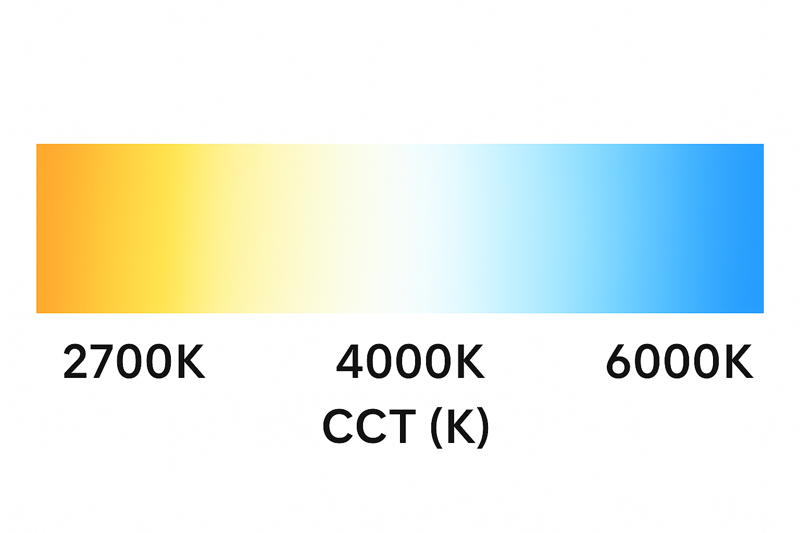
Think of a dimmer on a standard light bulb. It only changes the brightness. Now, imagine a different kind of dial that changes the feeling of the light, from the warm glow of a candle to the bright energy of a sunny afternoon. That’s essentially what choosing a CCT does. I always advise contractors to discuss CCT with their clients before the project begins. Don’t just ask if they want "white light." Ask them how they want the space to feel. Do you want this room to feel relaxing and cozy for watching movies? Or do you want it to feel bright and energizing for working? This simple conversation manages expectations and prevents the client from feeling that you’ve installed the "wrong" color. It positions you as a thoughtful designer, not just an installer.
Choosing the Right Mood: A CCT1 Application Guide
Selecting the wrong CCT is one of the most common and jarring mistakes in lighting design. Here’s how to get it right every time by matching the Kelvin temperature2 to the room’s purpose.
Warm White (2700K – 3000K)
- The Feeling: Cozy, intimate, relaxing, and inviting. This is the color of traditional incandescent bulbs and candlelight. It’s universally associated with comfort and home.
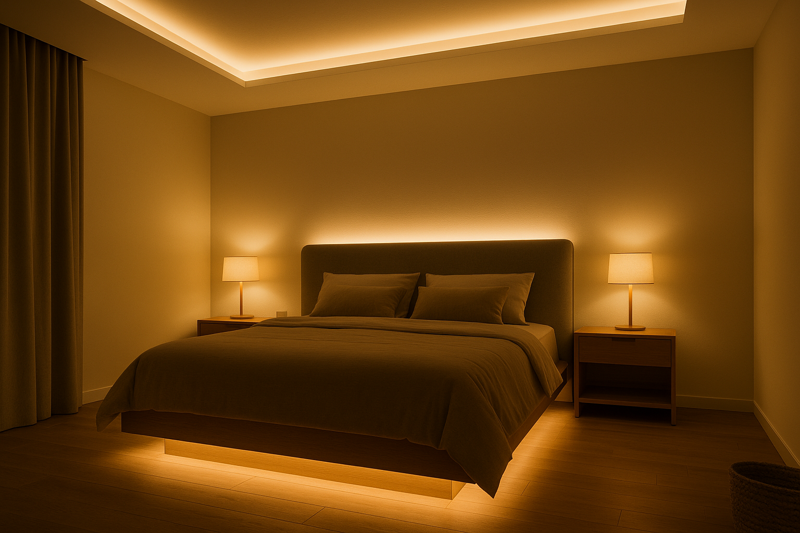
- Best Applications: Living rooms, bedrooms, dining rooms, restaurants, and hospitality settings. Use it anywhere you want people to slow down and relax. It enhances warm materials like wood and red/yellow paint tones.
Neutral White (3500K – 4000K)
- The Feeling: Clean, clear, and efficient. This light is more balanced and does not have a strong yellow or blue tint. It creates a sense of alertness without being harsh.
- Best Applications: Kitchens, bathrooms, offices, garages, and commercial retail spaces. It’s a perfect all-rounder for task-oriented areas where you need to see clearly but still want a comfortable atmosphere.
Cool White (5000K – 6500K)
- The Feeling: Bright, crisp, and energizing. This light is similar to natural daylight and can have a distinct bluish tint. It is intensely bright and promotes focus and high visibility.
- Best Applications: Task lighting workbenches, commercial warehouses, hospitals, and display areas where you need maximum brightness and contrast. It can feel sterile and clinical in a home setting if not used carefully.
| CCT Range | Common Name | Mood / Feeling | Ideal Application |
|---|---|---|---|
| 2700K – 3000K | Warm White | Cozy, Relaxing | Bedrooms, Living Rooms, Restaurants |
| 3500K – 4000K | Neutral White | Clear, Productive | Kitchens, Offices, Retail |
| 5000K – 6500K | Cool White | Alert, Daylight | Garages, Warehouses, Task Areas |
What is Color Rendering Index (CRI) and Why Is It So Important?
The color temperature (CCT) is perfect, but everything in the room still looks a bit "off." The deep red sofa looks slightly brown, skin tones look pale, and a wooden floor looks flat and lifeless. The light is the right shade, but it’s poor quality.
Color Rendering Index (CRI) measures how accurately a light source reveals the true colors of an object, on a scale of 0 to 100, with 100 (sunlight) being perfect. A low CRI light makes colors appear washed out and unnatural. For professional results, a CRI of 90+ is the minimum standard.
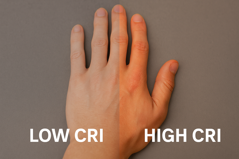
I explain CRI to my clients with a simple analogy: think of it as the difference between a standard TV and a 4K Ultra HD TV. They both show a picture, but the 4K TV shows the picture with incredible clarity, depth, and vibrant, true-to-life colors. A high-CRI light source does the same for the real world. A cheap LED strip with a low CRI (often around 80) is like that standard-definition TV. It produces light, but it’s missing key parts of the color spectrum. Specifically, it struggles to render deep reds (the R9 value). This is why red objects, wood grains, and human skin tones are the first things to look bad under cheap light. High-CRI (90+) strips have a much more complete and balanced light spectrum, so they render all colors—especially those crucial reds—beautifully and accurately.
CRI in Practice: Where Quality Shines
Understanding CRI is what separates an average installer from a true lighting professional. It’s a specification that has a direct and visible impact on the quality of a finished project.
-
CRI 80+ (Standard Quality)3: This is the baseline for most commercial and budget-grade residential lighting.
- Appearance: Colors are acceptable, but they may lack vibrancy. Reds will often appear muted or brownish. Fine for non-critical areas like hallways, storage closets, or basic garage lighting.
- Problem: If you use this in a kitchen, a fresh red bell pepper or a piece of salmon will look dull. In a closet, it will be harder to tell the difference between a black and a navy blue suit.
-
CRI 90+ (Professional Quality)4: This is the industry standard for high-end residential and commercial projects.
- Appearance: Colors are rendered accurately and appear rich and saturated. The difference is immediately noticeable, especially with wood tones, artwork, and food.
- Applications: This should be your default choice for kitchens, bathrooms (for accurate skin tones and makeup application), living rooms, art displays, and high-end retail.
-
CRI 95+ (Specification Grade)5: This is the highest tier, used where color accuracy6 is absolutely critical.
- Appearance: Provides the most accurate color rendering possible from an artificial light source, very closely mimicking natural daylight.
- Applications: Essential for art galleries, museums, photography studios, textile manufacturing, and high-end jewelry stores where seeing the absolute true color of an object is paramount.
When a client questions the price difference for a high-CRI product, you can confidently explain, "The CRI 90 strip costs more because it uses higher-quality LEDs that produce a full spectrum of light. This will ensure your new wooden cabinets and marble countertops look as rich and natural as they did in the showroom."
How Do You Ensure Color Consistency Across a Large Project?
You’ve completed a large open-concept space, installing LED strips in the kitchen, the dining room cove, and the living room bookshelf. The client loves it, but points out that the light in the kitchen is slightly more yellow than the light in the living room, even though you ordered the same 3000K strips.
To guarantee color consistency, you must source strips from the same manufacturing batch or "bin." Professional suppliers use a system called MacAdam ellipses, or SDCM (Standard Deviation of Color Matching), to ensure that the color of every strip is indistinguishable to the human eye.
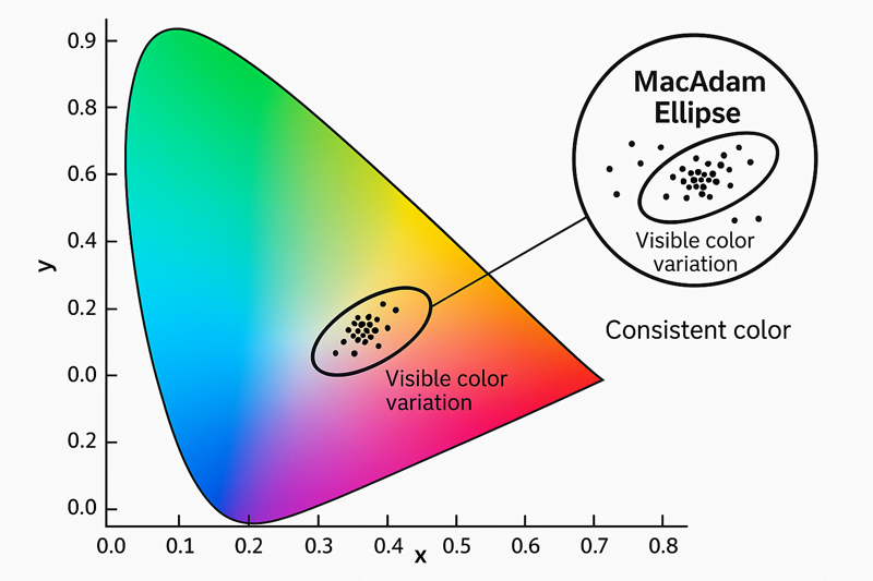
This is a problem that drives contractors crazy, and it stems from the complex process of manufacturing LEDs. No two LEDs are ever exactly the same color. When they are produced, they are tested and sorted into bins based on their precise color coordinates. Cheaper LED strips might mix LEDs from many different bins, resulting in noticeable color variations from one reel to the next, or even along the same reel. As a quality-focused factory, Rhlite invests heavily in a strict binning process. We use a 3-Step MacAdam ellipse (SDCM ≤ 3), which is a very tight tolerance. It means any variation in color between our LEDs is so small that the human eye cannot perceive it. When you install our strips throughout a home, the 3000K in the kitchen is a perfect match for the 3000K in the bedroom. For Tom, asking a supplier about their SDCM rating is a critical quality control question. A good answer is "3-Step or less." A vague answer is a major red flag.
The Professional’s Secret: Binning and SDCM7
Understanding this concept empowers you to demand and deliver perfect consistency for your clients.
| SDCM Value | Visibility to Human Eye | Quality Level | Best Use |
|---|---|---|---|
| 1-2 Step | Indistinguishable. | Specification Grade. | Museum and gallery lighting where multiple fixtures must create a perfectly uniform field of light. |
| 3-Step | Virtually indistinguishable. | Professional Standard. | The benchmark for high-end architectural and residential lighting. Guarantees consistency across a project. |
| 4-5 Step | Slight difference may be visible. | Standard / Commercial Grade. | Acceptable for applications where strips are not directly next to each other. Visible inconsistencies may occur. |
| 6+ Step | Noticeable color differences. | Budget / Low Quality. | High risk of mismatched colors. Not suitable for professional work where aesthetic consistency is required. |
How to Ensure Consistency on the Job:
- Ask Your Supplier: Before you place a large order, ask your supplier for the SDCM or MacAdam ellipse rating of the product. Anything above 4-step is a risk.
- Order for the Whole Job at Once: Whenever possible, order all the LED strips you need for a single project in one batch. This makes it far more likely that you will receive products from the same manufacturing run and color bin.
- Check Before You Install: Before you start cutting and installing, power up all your reels of strip light side-by-side on a white surface. This quick five-minute test can save you hours of rework if you spot a color mismatch8 before it’s permanently installed.
Conclusion
Color accuracy and consistency are not just technical terms; they are the foundation of professional lighting design. By mastering CCT to set the mood, demanding high CRI to reveal true beauty, and ensuring color consistency through proper binning, you can deliver flawless results that will thrill your clients.
-
Exploring CCT will help you grasp how color temperature affects ambiance and productivity in various environments. ↩
-
Understanding Kelvin temperature is crucial for selecting the right lighting to enhance mood and functionality in any space. ↩
-
Explore this link to understand the baseline for lighting quality and its impact on color vibrancy. ↩
-
Discover why CRI 90+ is the industry standard for high-end projects and how it enhances color accuracy. ↩
-
Learn about the highest tier of color accuracy and its essential applications in art and design. ↩
-
Find out how color accuracy influences lighting choices and enhances the overall aesthetic of spaces. ↩
-
Understanding SDCM is crucial for achieving color consistency in lighting projects, ensuring professional results. ↩
-
Preventing color mismatch is essential for maintaining aesthetic quality in lighting, making this resource invaluable for professionals. ↩


